R S Sanjanaa
I. Introduction
In recent years, the rise of technology has led to numerous trademark disputes involving multinational corporations. Examples include the conflicts between GlaxoSmithKline , GSK Life Sciences, Vogue and Just Lifestyle Pvt Ltd. However, a growing concern lies in the struggles faced by small businesses in a David and Goliath fashion. One such case is the recent battle between Mountain Dew and Magfast Beverages, highlighting the challenges faced by a small business in India when pitted against a Multinational Corporation (“MNC”).
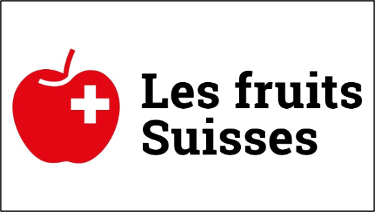
Adding to this series of trademark disputes, a new conflict has arisen between Apple and Fruit Union Suisse. Fruit Union Suisse, an organization with a history of 111 years dedicated to promoting the interests of Swiss fruit growers, is currently entangled in a legal dispute over its logo. The logo features a red apple with the Swiss national flag superimposed on it. This trademark dispute carries several legal implications, including the application of the prior use doctrine, the principle of honest adoption, and the concept of transborder reputation.
Source: Business Today
Within this context, the following article presents a comprehensive examination of logo and shape marks, with a specific focus on Apple’s extensive litigation strategy in trademark disputes on a global scale. It proceeds to analyze the lack of legitimacy in Apple’s claims against Fruit Union Suisse in Switzerland by aligning them with the principles of trademark law and the established jurisprudence discussed previously. Ultimately, the article concludes by asserting that engaging in legal battles against a multinational corporation of Apple’s magnitude has proven detrimental to the financial and goodwill resources of businesses, particularly those operating on a smaller scale. Consequently, it emphasizes the importance of distinguishing between justified legal actions and those that bear the characteristics of an uneven power dynamic.
II. Shape Marks
Shape marks form a brand’s aesthetic nature, enabling the consumer to distinguish between the various sellers. This can either be a logo shape mark, as is the case with “Larry the Bird” in Twitter’s logo, or a product shape mark, as is the case with Coca-Cola’s bottle shape, which is also extensively used in its marketing. In this context, the author restricts herself to the discussion on logo shape marks and not product shape marks. This pertains to the visual perception of a particular shape or configuration used within the logo to recognize the brand.
Logo marks have been recognized in a multitude of cases, such as the Nike v. MSCHF dispute, wherein MSCHF had released shoes with the swoosh symbol on them. Similarly, in the case of Daimler AG v. Sany Group Company Ltd., the British High Court had upheld the three-star mark of Mercedes Benz to be distinctive and attributable to the brand. However, the Court finally dismissed the claim of Daimler AG as it believed that Sany Group’s logo did not “call to mind” Benz’s logo.
III. Apple’s Over-Litigious Usage of its Logo Mark and Contentions in the Present Matter
Apple has frequently utilized its distinctive bitten apple shape proactively in trademark disputes. As per a study by the Tech Transparency Project, Apple filed more trademark disputes than Microsoft, Facebook, Amazon, and Google combined between 2019 and 2021. Journalist Jennifer 8 Lee, for that matter, has commented on how Apple might just end up taking a baby to court since it was born with a birthmark that is shaped like an apple.
III. A. Previous Instances of Shape Mark Enforcement
One such case that initiated this debate over Apple’s usage of its logo mark was the Apple Corps dispute. In this case, the Beatles company used a green apple logo. Through a settlement, Apple succeeded in eliminating the Beatles from this industry. Later on, a final resolution was reached in 2007 that granted Apple the full rights to the logo after the 1986 and 2003 issues on the introduction of music-related products by Apple, such as the Macintosh.
In the case concerning GreeNYC, the logo of the campaign for a green environment in New York City was contested by Apple. It stated that this could cause confusion for consumers and dilute the brand’s distinctiveness. This received mass criticism from the entire city, which believed that no consumer would be confused. In fact, the aforementioned Beatles’ logo was more similar to GreeNYC’s logo than to Apple’s.
Following this, in the case concerning Woolworth, an Australian supermarket chain, the company used an apple shaped like a W, which Apple contested. Hans Hulsboch, the designer of the logo, opined in an article that if this continued, every fruit seller would be pursued by Apple. Woolworth strongly contended that the symbolism of the fruit apple was of freshness and quality and that it represented the brand of the supermarket. However, Apple won the dispute out-of-court with Woolworth changing its logo in 2012.
In 2009, Apple launched a dispute against Foxtel as it had a pornography channel with a logo wherein an apple had an arrow and a devil’s tail, the resemblance being dubious. Similarly, a dispute was launched against a music festival promoter called Poison Apple for having a logo of an apple that was bitten for most of its portion with crossed bones on it.
Apple’s disputes do not just extend to the consumer goods sector; about 20% of its trademark disputes go against the education sector since apples are extensively used there to symbolize teaching. In 2008, Apple dragged a Canadian school into a trademark dispute for its use of an apple on its logo with the letters VSBT imprinted in it. It contended that the school was showcasing that Apple had endorsed this school by using such a logo since it was engaged in providing iPads and Macbooks for education. A similar argument arose when Apple launched a dispute against 3.14 Academy, an NGO working towards education for children with autism.
III. B. Disputing beyond the realm of an apple- Expanding boundaries?
In a surprising yet not-so-surprising move, in a recent case in 2019, Apple went beyond the conventional apple fruit. It launched a trademark dispute with Pear Technologies Ltd. The latter had filed for trademarks with the EU trademark authority in Classes 9, 35, and 42. The logo had the outline of a pear with a few round-edged cubes fitted inside in a black-and-white format. Apple filed an opposition under the same Classes.
The Court of Justice of the European Communities (“CJEU”) overturned the Board of Appeal’s decision in this rather interesting case. The first contention of Pear Ltd. was that pursuant to Regulation 207/2009, Clause 8(5), the two marks must be identical or at least similar. In assessing this, the Board of Appeal had initially ruled that there was a low level of visual similarity as both the logos had similar graphical features, especially since both were in black and white. The CJEU Court had also noted Apple’s earlier reputation in the EU. Reputation is a factor in the EU for trademark disputes to assess the link between the logos and public perception. However, this is not a consideration to be taken unless there is an actual similarity, and this was highlighted by the CJEUlater on. The CJEU held that the only similarities were the color and the similar positioning of the figurative elements above the fruit depictions, and even this would go unnoticed by the public.
The other contention was the conceptual similarity between an apple and a pear, which was upheld by the Board of Appeal. However, the CJEU later referred to the case of SABEL, wherein the court found conceptual similarity in the logos since both had a leaping feline and not because they simply had two animals (a cheetah and a puma) that were similar in real life. Going by this logic, there would be no conceptual similarity between the two logos merely because both of them were fruits.
III. C. Contentions against Fruit Union Suisse
Following this history of advantages gained by Apple, the company is now back with another trademark dispute against Fruit Union Suisse. In fact, this isn’t the first time that Apple has competed in Switzerland. Previously, it has succeeded in getting a small grocer’s’ cooperative to agree to never use a bitten apple in their logo.
In 2017, the MNC filed an application with the Swiss Institute of Intellectual Property for a black-and-white picture of the Granny Smith apple variety in order to restrict others from using similar logos. The authority had granted partial allowance of this for certain goods alone, as it stated that apples are a common good that is part of the public domain. Apple has appealed against this decision, which is yet to be decided. The catch here is that by doing so, Apple is seeking exclusive image rights for all images of apples in Switzerland. If it wins, then Fruit Union Suisse would have to change its century-old logo, affecting over 8,000 apple farmers in its community.
IV. Questioning the Validity of a Favorable Outcome
This author believes that the outcome, in this case, should not be favorable to Apple for the reasons listed below.
IV. A. Actual shape of the Apple logo is not imprinted
The Apple logo has a distinctive bite on the right part of the fruit. In very few cases this distinction has been upheld by the Court. For instance, in the case concerning Apfel Route, the logo has an apple with a bitten right side. It uses this logo on all its clothes, bike racks, cycling maps, and banners. Similarly, in the matter concerning Education Associates, the logo has a red outline of an apple with the right portion missing and an arrow mark on top. In such matters, the launch of a dispute gains credibility, given the actual similarity of the logos.
Another structural characteristic is the presence of a leaf on the Apple logo. In a dispute against Dr. Surya Reddy that Apple won, the logo of the former also had a piece of the apple missing and an “angled-detached leaf,” as described by Apple.
In the given case, on a simplistic view of both logos, any common man would identify that there is no similarity in the sense that one is a whole apple while the other is a bitten apple. This has also been the case with all the aforementioned cases except for Poison Apple. But even in the latter, the bite was much larger and on a different portion of the apple. Secondly, the Fruit Union Suisse’s apple does not have a leaf on top but rather a stem, which also looks attached to the fruit.
IV. B. Colors don’t match for similarity
The Apple logo has undergone multiple revisions. What started off as a rainbow-colored logo, has been on the black-and-white spectrum for a while now. While looking at the similarity between two logos, this color visualization, therefore, becomes crucial. In the aforementioned 2019 case involving Pear Technologies Ltd., although the Court later concluded that it should not be the sole determining factor, one of the primary considerations for the Board of Appeal was the visual similarity in black and white between the two logos. In contrast to the Apple logo, the Fruit Union Suisse’s logo has a bright red apple with a white cross on the inside depicting the Swiss flag.
IV. C. A Common Good
When Gary Anderson created the recycling symbol for a design contest sponsored by the Container Corporation of America, the symbol became available to the public because of its global recognition. It wasn’t owned by any corporation and has remained a symbol of a collective effort to promote eco-consciousness. Several entities have used this- for instance, Keleco and the Greenville County Solid Waste Division both have this imprinted in their logos.
Historically, the apple has long held significance as a universally accessible commodity, dating back to the time of hunters and gatherers. Apple Inc. has already obtained significant trademark protection for various representations of the fruit. However, if further protection is granted and the Fruit Union Suisse case rules in favor of Apple, it would effectively establish Apple’s trademark dominance over the entire concept of the fruit. This could potentially extend Apple’s control beyond its specific logo or brand, encroaching upon the broader notion of the apple as a common symbol. Jimmy Mariethoz, director of Fruit Union Suisse, quotes- “Their objective here is really to own the rights to an actual apple, which for us, is something that is really almost universal.. that should be free for everyone to use.”
IV. D. Prior Use by Fruit Union Suisse
The Swiss trademark law operates on the prior use doctrine. It states that the owner of a mark cannot prohibit another person from using a sign if the usage existed prior to the filing of the application for the trademark. This right is only assignable to the company that holds it and only applies to the extent of actual prior use. This is also in line with the “first in the market” principle of trademark law, which states that protection shall be granted to entities who can prove that they were the first to appear in the world and thereafter have gained a reputation.
In the present case, the fact that Fruit Union Suisse has been using this logo for over 100 years while Apple was only created in 1976 clearly shows the prior use rights assignable to Fruit Union Suisse. Moreover, this would only bring into question the limitation period applicable under which it could be argued that Apple’s right has lapsed as it is bringing forth the claim after several decades of its inception. In Swiss Law, this is protected under the ambit of good faith, and manifest abuse of the law is not allowed.
IV. E. Honest Adoption by Fruit Union Suisse
The other argument that Fruit Union Suisse can use is the principle of honest adoption. This states that there can be two similar trademarks registered in cases of honest and concurrent use. Following this, in the Apple Corps dispute, the two companies chose distinct fields of use even though they had similar marks. Apple Computer said it would use it “on or in connection with electronic goods, computer software, data processing, and data transmission services”, and Apple Corps said it would use it “on or in connection with any current or future creative work whose principle content was music and/or musical performances, regardless of the means by which those works were recorded, or communicated, whether tangible or intangible.” The World Intellectual Property Organization recognizes this concurrent usage principle but sets out two additional considerations prior to granting such usage- one, public interest, and two, antitrust.
In the present case, the usage would be honest, as Fruit Union Suisse had this logo for a longer period than Apple. Moreover, Apple and Fruit Union Suisse operate in entirely different fields of use. In this case, public interest would not be affected, given that their marks are not similar except that they have the same fruit. Competition or anti-trust would also be kept in check, as the allowance of Fruit Union Suisse to continue with its logo would in no way affect the entry of new market players or disturb present players.
IV. F. Transborder Reputation as a Questionable Defense
The argument concerning transborder reputation would be one that Apple could make. This states that the reputation that is associated with a brand will transcend the jurisdiction of its origin and seep into other countries as well. However, this would not be a legitimate defense. Firstly, this follows from the universality doctrine of common law, and Switzerland is a civil law country.
Secondly, even if the Trade-Related Aspects of Intellectual Property Marks Agreement were to be enforced, as Switzerland is a party to this, the Agreement under Clause 16(3) clearly states that there should be a “conflict of trade” for using this “well-known” mark principle for dissimilar goods or services. In the ongoing trademark dispute with Fruit Union Suisse, it is important to note that Apple and Fruit Union Suisse operate in completely different industries, making it highly unlikely for Apple to venture into apple farming.
Thirdly, as seen through the Pear Technologies Ltd. case, visual similarity becomes a prerequisite to assessing reputation. This is also absent in this case.
V. Conclusion
Apple has been extremely vigilant when it comes to trademark disputes in recent years. In particular, small businesses have been at a loss as they also succumb to the financial resources of this trillion-dollar-valued MNC. When Apple went against 3.14 Academy, founder Celeste Chamberlain mentioned how she had to pay $10,000 for legal expenses and the graphic design of her logo, which had to come from her own pocket. A similar experience was shared by Latrina Walden, who runs a company for test preparation. Most of the time, the logos do not even match structurally, as seen above. This makes it difficult for any entity to advertise with an apple on its logo. While it is essential for entities to not lay dormant on their trademark awareness, Apple cannot perceive its consumers as being naive enough to confuse the logo with dissimilar ones, especially in different industries. It is walking a fine line between justified and Goliath-esque. However, in the best interest of trademark law, entities should attempt to pick unique logos to represent their brand to avoid such turmoil.
The author is a student from Symbiosis Law School, Pune.
